Is Your AI Design Already Getting Old?
AI makes polished design easier to produce. It also makes familiar ideas easier to repeat. What happens when your new identity already looks like everyone else's?
Have you looked at a logo you loved three months ago and wondered why it already feels old?
The curves are still smooth. The colors still work. Nothing about the file has changed. But you have since seen something very similar on six other products, a pitch deck, and a new productivity app.
That feeling is the interesting part. A design can lose its freshness without losing any of its polish.
AI makes it much easier to produce a logo, a website, or an entire visual identity. I like that change. In Design Is Now a Conversation, I wrote about what becomes possible when an idea can turn into a working interface without waiting for a specialist.
There is a catch: everyone else has access to that same shortcut.
When “good” starts to look familiar
Ask for a modern, premium, innovative technology brand. Those words sound like a brief, but they say almost nothing about the particular business.
They leave plenty of room for familiar answers: a soft gradient, a rounded wordmark, an abstract loop, a small sparkle. Each choice can work. Put them together without a reason, and the result could belong to almost anyone.
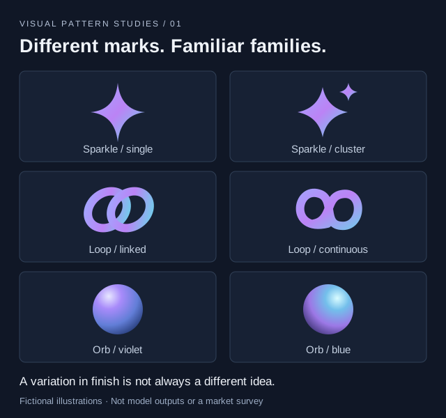
The sparkle is a useful example because its spread has been documented. In September 2024, Nielsen Norman Group examined its use across interfaces and found that people interpreted it in different ways. It could suggest an AI feature, a promotion, something new, or something else entirely.
A symbol can become familiar across a category without clearly explaining a feature or distinguishing a brand. Those are different jobs.
And a familiar-looking logo does not tell us how it was made. A human designer can follow the same fashion. AI can help produce something distinctive. The concern is what happens when many people accept similar first answers.
Better individually, more alike together
Research gives us a more useful explanation than “AI cannot be creative.”
In a study published in Science Advances in 2024, Anil Doshi and Oliver Hauser found that access to AI-generated ideas improved evaluations of short stories, particularly for less creative writers. The AI-assisted stories also became more similar to each other. The authors’ freely accessible manuscript describes both effects.
That study concerned writing, not logos. It does, however, illustrate a tension worth watching in design: each person’s result can improve while the collection becomes less varied.
There is also evidence closer to visual work. A CHI 2024 experiment with 60 participants found that people using an AI image generator during a visual ideation task became more fixated on an initial example. They produced fewer ideas, with less variety and lower originality than the baseline group.
That is a risk of the workflow. Once the first image looks convincing, it becomes easy to spend the next twenty prompts adjusting its colors and shadows. You are making variations before you have explored different ideas.
The findings are not uniformly negative. A CHI 2026 study with 36 participants designing advertisements found that AI-supported work was judged more creative and unconventional. Yet neither clients nor online volunteers judged it more useful, and clients saw no improvement in brand alignment.
These are different tasks and experiments. Together, they are a reason to evaluate more than how impressive the first draft looks. Novelty, variety, and usefulness do not automatically arrive together.
The three-month feeling
I have not found evidence that a good logo now expires after three months. That is a feeling to investigate, not a measured shelf life.
My interpretation is that AI can make visual fatigue arrive sooner by reducing the effort needed to reproduce a fashionable look. A treatment feels fresh, people request similar work, and soon the treatment itself becomes recognizable. You start noticing the style before you notice the company.
This happened before generative AI. BUCK’s account of Facebook’s Alegria illustration system dates the project to a commission in 2017 and describes its flat geometric shapes, oversized limbs, and non-representational skin colors. The studio also acknowledges the imitators. A specific visual system became a widely recognizable reference.
AI makes following a reference easier. It does not invent the urge to follow one.
That distinction matters because the answer is not to redesign your company every quarter. Familiarity can be valuable when customers associate it with you. The problem is familiarity that points to a whole category instead.
Give the design something specific to express
“Make it unique” is almost as vague as “make it modern.” A better starting point is information that would change the answer.
Imagine a coffee cooperative in Costa Rica. A generic request might be:
Create a premium coffee brand with a modern logo.
A more useful brief would describe the cooperative’s actual work: which producers it represents, how it records harvests, where the coffee grows, what goes on the bag, and what a buyer needs to understand. It might include photographs of the place, a sketch from a producer, or a detail from an old delivery stamp.
Those details give you something to choose between. A decorative coffee bean may be appropriate. So might a mark built around planting rows or a system that makes the producer and harvest lot unusually prominent. The decision should follow the business.
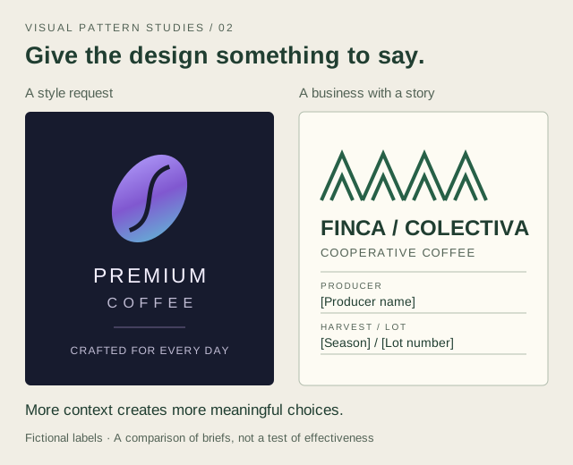
The point is not that green ink beats gradients. A rustic stamp can become just as interchangeable as a glowing orb. What matters is whether you can explain the choice through this particular business and its customers.
Use the speed to explore further
Here is how I would put that into practice:
- Write down the business before the style. Name the audience, the promise, the real materials available, and what competitors already look like.
- Explore different concepts before variations. A typographic direction, a symbol drawn from the work, and a direction based on a place are different ideas. Three purple loops are usually variations of one idea.
- Compare the result with its neighbors. Put it beside competing identities. Cover the names. Notice which choices still help someone tell them apart.
- Test ordinary use. Check a small icon, a single-color print, a long product name, and a real page full of information. A beautiful presentation can hide a weak system.
- Keep what people learn to recognize. Change a treatment when there is a reason. Give the identity enough consistency to become associated with the business.
AI gives us room to try more directions. If we spend all that saved time polishing the first familiar one, we miss much of the opportunity.
The next time a three-month-old logo feels tired, ask what made it appealing in the first place. Was there an idea tied to the company? Or did it mainly look like what a good logo looked like that month?
That is a much more useful question than whether AI made it.
References
- Kate Kaplan, Nielsen Norman Group (2024): The Proliferation and Problem of the Sparkles Icon.
- Anil R. Doshi and Oliver P. Hauser, Science Advances (2024): Generative AI enhances individual creativity but reduces the collective diversity of novel content. Open manuscript.
- Samangi Wadinambiarachchi and colleagues, CHI 2024: The Effects of Generative AI on Design Fixation and Divergent Thinking.
- Yue Fu and colleagues, CHI 2026: Decoupling of Usefulness and Novelty.
- BUCK: Facebook Alegria, the studio’s account of the original illustration system.